Ever walked into a room, seen a painting, and felt something shift inside you? A wave of calm, a jolt of excitement, or even a sudden sadness? That’s the power of color and composition in art. This isn't just imagination; it’s real, emotional, and scientifically backed.
This blog dives deep into how color in artwork affects our emotions and how artists like Miguel Camarena harness it to create unforgettable mood artwork. Whether you’re an art lover, a collector, or someone exploring your creative side, understanding the role of mood in art can change how you see and feel art forever.
The Psychology Behind Color and Mood
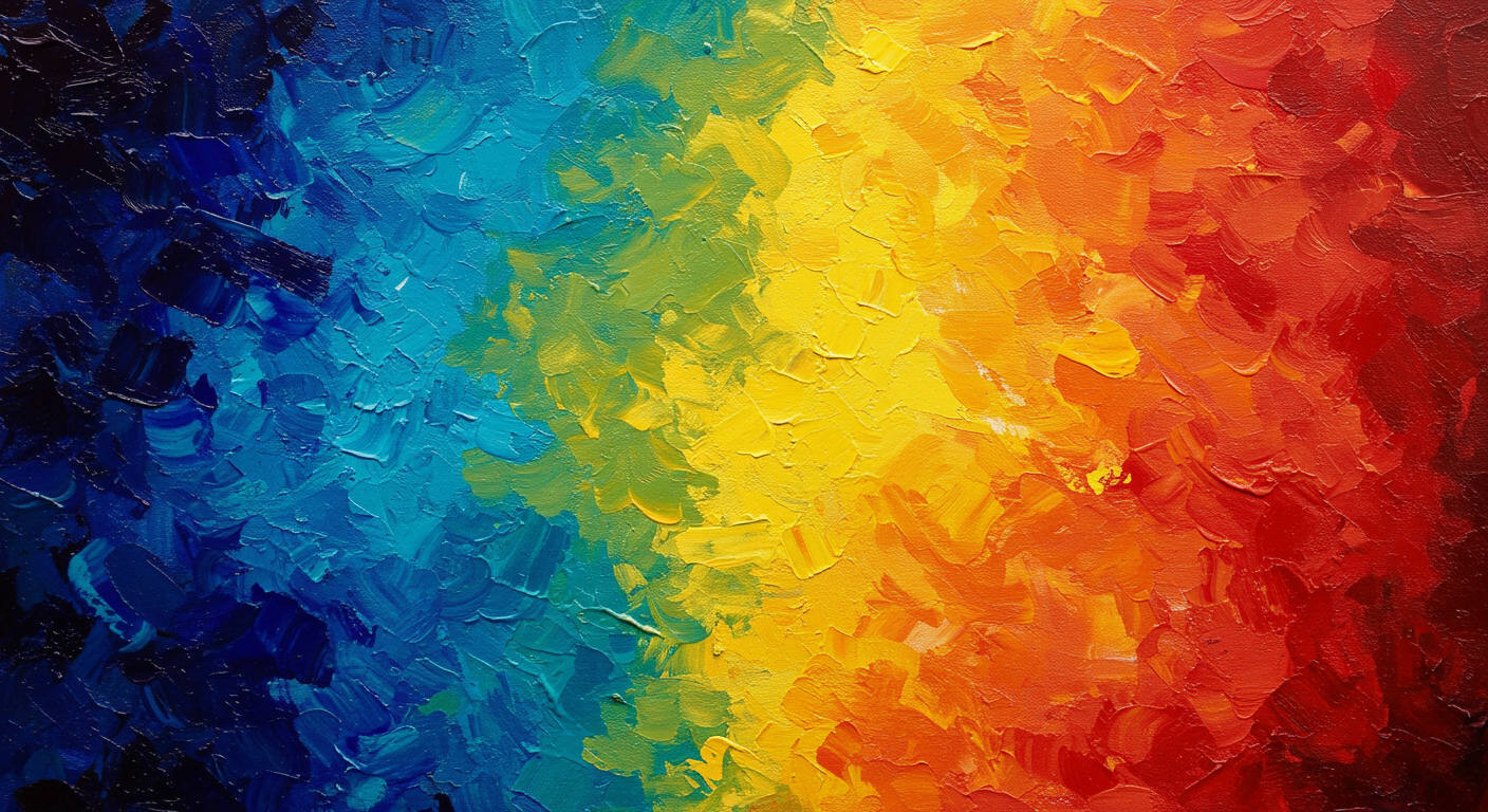
Colors do more than decorate; they communicate. In psychology, each color triggers a specific emotional response. Artists leverage this science to speak without words. Red often conveys passion, urgency, or anger. Blue soothes, representing calm or sadness. Yellow energizes. Green relaxes. The combinations? Endless and emotionally complex.
Artists deliberately choose colors to create a mood in their artwork. It’s not just about aesthetics. It’s about creating an emotional journey. For example, cooler tones like blues and purples can bring a tranquil or introspective mood. Warm tones like reds and oranges invite excitement or tension.
This relationship between emotion and color is what makes mood art so compelling. It’s visceral. It’s immediate. It’s why one viewer might stare at a painting for hours while another walks right past it.
Historical Perspectives: Mood in Artwork Through the Ages
Throughout history, artists have used color to channel emotional and cultural narratives. One of the most notable examples? Picasso’s Blue Period. The Spanish artist painted using predominantly blue hues to reflect grief, loneliness, and poverty. This wasn’t just stylistic; it was emotional storytelling through color.
In the late 19th century, Tonalism emerged. This movement emphasized soft, muted color palettes to create mood-driven landscapes. Artists like James McNeill Whistler used hazy tones and subtle gradients to evoke melancholy and mystery.
Color also played a key role in Expressionism. Edvard Munch’s “The Scream” isn’t just about a screaming figure; it’s the surrounding swirling reds and oranges that build tension and anxiety.
Looking back, we see that mood artwork has always been about tapping into the human experience. Artists have used color as a language to express what words cannot.
Contemporary Artists and Mood Art
Today, the tradition continues, but with modern twists. Many contemporary artists use vivid or subdued color palettes to connect with viewers emotionally.
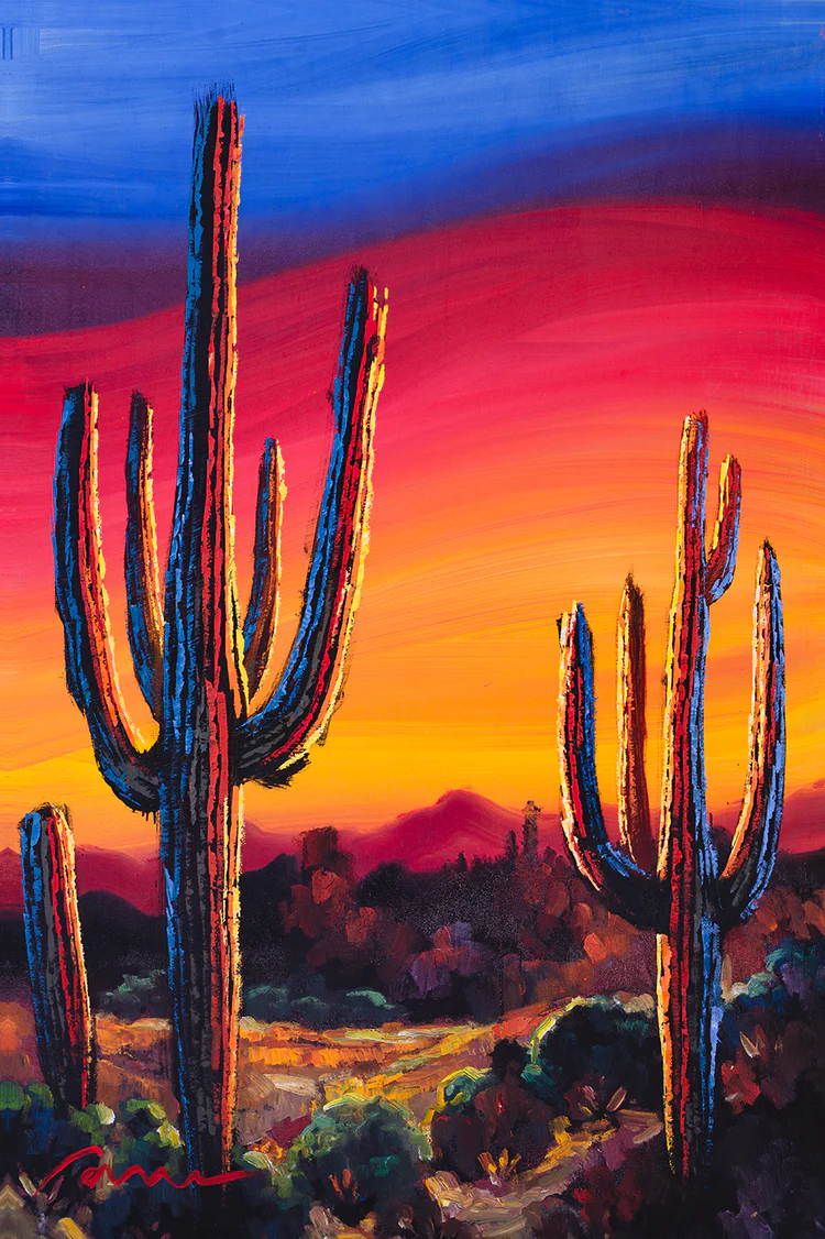
Miguel Camarena, for instance, blends bold colors with textured techniques that create a sensory and emotional impact. His work doesn’t just depict a subject; it conveys an atmosphere. A sunset in his painting might not be orange, but a mix of blush pink, soft lavender, and burnt sienna, each carefully chosen to evoke serenity and warmth.
Other modern artists like Mark Rothko and Gerhard Richter have used large swaths of color to push the boundaries of emotion. Rothko’s color fields aren’t just paint; they’re spaces for contemplation. People often describe crying in front of them. That’s mood art at its peak.
What these artists show us is simple: you don’t need realism to feel something. You just need color, intention, and space.
Cultural Interpretations of Color and Mood
Colors don’t mean the same thing everywhere. In Western cultures, white often symbolizes purity. In many Eastern cultures, it’s linked with mourning. Red, seen as love and passion in the West, represents good fortune and joy in China.
Understanding color in artwork requires a cultural lens. Artists around the world use colors to reflect not just mood, but identity, tradition, and shared emotion.
Take Indian art. Vibrant, saturated palettes dominate because color is integral to spiritual and celebratory life. Or Japanese minimalist art, where muted tones and empty space evoke peace, harmony, and impermanence.
As global audiences interact more with digital and physical art from different cultures, this intersection of mood and color becomes richer and more layered. Appreciating mood artwork also means appreciating the cultural narratives behind those colors.
Engaging with Mood Art: Tips for Viewers and Creators
Want to feel more connected to the art you see or create? Here’s how:
For Viewers:
-
Observe, then feel. Don’t just glance but immerse yourself. Let your instincts guide the first impression. What mood does it create? Joy? Melancholy? Awe?
-
Note the palette. Warm tones like amber and crimson may spark passion or urgency, while cool blues and muted greens soothe or inspire thoughtfulness. Consider how the color scheme pulls you in or pushes you away.
-
Consider the context. What’s the origin of the work? Understanding who created it, and when and where it was made, can unveil deeper emotional layers. Is it a modern piece challenging norms or a traditional one preserving emotion through heritage? All of this affects how you interpret the mood in artwork.
For Creators:
-
Choose with intent. Every color on your palette should serve a purpose. Whether you’re channeling calm or chaos, let your choices be deliberate.
-
Limit or expand. A single dominant color might carry immense emotional weight, while layered contrasts could add complexity and intrigue.
-
Test it. Share it. Ask others how it makes them feel. Different eyes bring fresh emotional readings and use their feedback to refine your work and deepen the emotional connection.
Whether you’re a casual admirer or an emerging artist, engaging with mood art helps deepen your relationship with creativity.
Conclusion: Why Mood Art Matters
Art isn’t just seen; it’s felt. And much of that feeling comes from the silent language of color. The artists who understand this, from the masters of the past to visionaries like Miguel Camarena today, craft more than images. They create emotional experiences.
Mood artwork reminds us of our own emotional spectrum. It’s personal. It’s powerful. And it’s everywhere from gallery walls to digital screens.
So next time you stand in front of a painting, pause. Look at the colors. Feel what they’re saying. That’s the art doing its job.